# 隐藏滚动条
scrollbar-width: none;
&::-webkit-scrollbar {
  display: none;
  width: 0;
}
scroll-behavior: smooth;
2
3
4
5
6
# 计算属性 calc()
例:width: calc(100% - 80px);,支持加减乘除运算,括号中的+ 和 - 运算符的两边必须要有空白字符。* 和 / 这两个运算符前后不需要空白字符,但可以加上。用 0 作除数会使 HTML 解析器抛出异常。
比如,calc(50% -8px) 会被解析成为一个无效的表达式,解析结果是:一个百分比 后跟一个负数长度值。而加有空白字符的、有效的表达式 calc(8px + -50%) 会被解析成为:一个长度 后跟一个加号 再跟一个负百分比。
# 滚动行为
scroll-behavior 为一个滚动框指定滚动行为,其他任何的滚动,例如那些由于用户行为而产生的滚动,不受这个属性的影响。在根元素中指定这个属性时,它反而适用于视窗。
- auto:滚动框立即滚动。
- smooth:比 auto 更「平稳」顺滑流畅滚动。
# 限制文字显示行数
- -webkit-line-clamp
overflow: hidden;
display: -webkit-box;
-webkit-box-orient: vertical;
-webkit-line-clamp: 2;
word-break: break-all;
max-height: calc(2 * 1.15 * 1.5rem);
line-height: 25px;
2
3
4
5
6
7
- text-overflow: ellipsis
- 配合块级元素
overflow: hidden;
text-overflow: ellipsis;
white-space: nowrap;
2
3
# Sticky
粘性定位可以被认为是相对定位和固定定位的混合。元素在跨越特定阈值前为相对定位,之后为固定定位。
用法:父级容器要有 height,overflow: scroll/auto/visible 要能滚动!; 子元素 position: sticky;基于 top, right, bottom, 和 left 的值进行偏移。跟 position 无关!
须指定 top, right, bottom 或 left 四个阈值其中之一,才可使粘性定位生效。否则其行为与相对定位 position:relative 相同。
MDN: 元素根据正常文档流进行定位,然后相对它的最近滚动祖先(nearest scrolling ancestor)和 containing block (最近块级祖先 nearest block-level ancestor),包括 table-related 元素,基于 top, right, bottom, 和 left 的值进行偏移。偏移值不会影响任何其他元素的位置。
该值总是创建一个新的层叠上下文(stacking context)。注意,一个 sticky 元素会“固定”在离它最近的一个拥有“滚动机制”的祖先上(当该祖先的 overflow 是 hidden, scroll, auto, 或 overlay 时),即便这个祖先不是最近的真实可滚动祖先。这有效地抑制了任何“sticky”行为。
# getComputedStyle()
Window.getComputedStyle(获取计算样式的 Element,要匹配的伪元素的字符串)方法返回一个对象,该对象在应用活动样式表并解析这些值可能包含的任何基本计算后报告元素的所有 CSS 属性的值。
CSS 属性的值: initial, computed, resolved, specified, used, and actual values.即初始、计算、解析、指定、使用和实际值。
let elem1 = document.getElementById("elemId");
let style = window.getComputedStyle(elem1, null);

// 它等价于
// let style = document.defaultView.getComputedStyle(elem1, null);
2
3
4
5
6
# clear
MDN: clear CSS 属性指定一个元素是否必须移动(清除浮动后)到在它之前的浮动元素下面。clear 属性适用于浮动和非浮动元素。
MDN: 当应用于非浮动块时,它将非浮动块的边框边界移动到所有相关浮动元素外边界的下方。这个非浮动块的垂直外边距会折叠。
MDN: 另一方面,两个浮动元素的垂直外边距将不会折叠。当应用于浮动元素时,它将元素的外边界移动到所有相关的浮动元素外边框边界的下方。这会影响后面浮动元素的布局,后面的浮动元素的位置无法高于它之前的元素。
MDN: 要被清除的相关浮动元素指的是在相同块级格式化上下文中的前置浮动。
MDN: 注意:如果一个元素里只有浮动元素,那它的高度会是 0。如果你想要它自适应即包含所有浮动元素,那你需要清除它的子元素。一种方法叫做 clearfix,即 clear 一个不浮动的 ::after 伪元素。
#container::after {
  content: "";
  display: block;
  clear: both;
}
2
3
4
5
# SCSS/SASS
使用 CSS 预处理器,提供 CSS 缺失的样式层复用机制、减少冗余代码,提高样式代码的可维护性。大大提高了我们的开发效率。
SCSS 是 Sass 3 引入新的语法,其语法完全兼容 CSS3,并且继承了 Sass 的强大功能。Sass 和 SCSS 其实是同一种东西,我们平时都称之为 Sass,两者之间不同之处有以下两点:
文件扩展名不同,Sass 是以“.sass”后缀为扩展名,而 SCSS 是以“.scss”后缀为扩展名
语法书写方式不同,Sass 是以严格的缩进式语法规则来书写,不带大括号({})和分号(😉,而 SCSS 的语法书写和我们的 CSS 语法书写方式非常类似。
# index.scss  定义变量并导出
$primary-color: #f40000;

:export {
  primaryColor: $primary-color;
}

# index.js
import styles from './index.scss';
// 可以直接引入并使用scss变量
console.log('styles', styles.primaryColor);
2
3
4
5
6
7
8
9
10
11
# 查看 UI 轮廓 outline
- 这里没有使用 border 的原因是 border 会增加元素的大小但是 outline 不会;
- 通过这个技巧不仅能帮助我们在开发中迅速了解元素所在的位置,还能帮助我们方便地查看任意网站的布局;
- 所有浏览器都支持 outline 属性;outline (轮廓)是绘制于元素周围的一条线,位于边框边缘的外围,可起到突出元素的作用;
- 轮廓线不会占据空间,也不一定是矩形(比如 2D 转换等)。
html * {
  outline: 1px solid red;
}
2
3
# 提高长列表加载性能
- content-visibility 属性有三个可选值:
- visible: 默认值。对布局和呈现不会产生什么影响。
- hidden: 元素跳过其内容的呈现。用户代理功能(例如,在页面中查找,按 Tab 键顺序导航等)不可访问已跳过的内容,也不能选择或聚焦。类似于对其内容设置了 display: none 属性。
- auto: 对于用户可见区域的元素,浏览器会正常渲染其内容;对于不可见区域的元素,浏览器会暂时跳过其内容的呈现,等到其处于用户可见区域时,浏览器在渲染其内容。
.card {
  position: relative;
  overflow: hidden;
  transition-duration: 0.3s;
  margin-bottom: 10px;
  width: 200px;
  height: 100px;
  background-color: #ffaa00;
  **content-visibility: auto;**
  // 添加此行:目的是在一定程度上解决滚动条上下跳动的问题,取一个item的大致高度作为初始高度
  **contain-intrinsic-size: 312px;**
}
.card:before {
  content: '';
  position: absolute;
  left: -665px;
  top: -460px;
  width: 300px;
  height: 15px;
  background-color: rgba(255, 255, 255, 0.5);
  transform: rotate(-45deg);
  animation: searchLights 2s ease-in 0s infinite;
}
@keyframes searchLights {
  0% {
  }
  75% {
    left: -100px;
    top: 0;
  }
  100% {
    left: 120px;
    top: 100px;
  }
}
2
3
4
5
6
7
8
9
10
11
12
13
14
15
16
17
18
19
20
21
22
23
24
25
26
27
28
29
30
31
32
33
34
35
# 隐藏打印弹窗
@media print {
  body {
    display: none !important;
  }
}
2
3
4
5
# transform-origin
- 设置元素转换的原点/起点。初始值 50% 50% 0,即默认的转换原点是 center。
- transform-origin 属性可以使用一个,两个或三个值来指定,其中每个值都表示一个偏移量。 没有明确定义的偏移将重置为其对应的初始值。
- 如果定义了两个或更多值并且没有值的关键字,或者唯一使用的关键字是 center,则第一个值表示水平偏移量,第二个值表示垂直偏移量。
- 一个值:
- 必须是
<length>,<percentage>,或 left, center, right, top, bottom 关键字中的一个。
- 必须是
- 两个值:
- 其中一个必须是
<length>,<percentage>,或 left, center, right 关键字中的一个。 - 另一个必须是
<length>,<percentage>,或 top, center, bottom 关键字中的一个。
- 其中一个必须是
- 三个值:
- 前两个值和只有两个值时的用法相同。
- 第三个值必须是
<length>。它始终代表 Z 轴偏移量。
# 修改图片「颜色」-- drop-shadow
- 背景色变化时突出图片,或者修改某个 icon 的背景色以实现变色(UI 垃圾!)。
- drop-shadow 可用于 png 图片变色。
img {
	width: 16px;
	height: 16px;
	margin: 0 0 4px 8px;
	filter: drop-shadow(0px 0px red); # x,y,color
}
2
3
4
5
6
- 通过 img 引入的 svg 如何改颜色?例如:
<img src="img/success.svg">。
- 通过 drop-shadow,把原始的 img 移到窗口/移出视线之外
img {
  position: relative;
  left: -8000px;
  filter: drop-shadow(8000px 0px red);
}
2
3
4
5
- 通过插件
svg-inject,npm install @iconfu/svg-inject
<html>
  <head>
    <script src="svg-inject.min.js"></script>
    <style>
      .svg-img g {
        fill: blue;
      }
    </style>
  </head>
  <body>
    <img class="svg-img" src="image1.svg" onload="SVGInject(this)" />
  </body>
</html>
2
3
4
5
6
7
8
9
10
11
12
13
- 通过 svg 的 fill 属性,直接修改 svg 的颜色。(需要修改 svg 文件),如下,也可以同时设置
height/width/stroke属性。
<svg
  xmlns="http://www.w3.org/2000/svg"
  stroke="#4A494A"
  stroke-width="6"
  stroke-miterlimit="10"
  height="24"
  width="24"
  viewBox="0 -960 960 960"
  fill="#000000">
  <path
    d="m480-438 129 129q9 9 21 9t21-9q9-9 9-21t-9-21L522-480l129-129q9-9 9-21t-9-21q-9-9-21-9t-21 9L480-522 351-651q-9-9-21-9t-21 9q-9 9-9 21t9 21l129 129-129 129q-9 9-9 21t9 21q9 9 21 9t21-9l129-129Zm0 358q-82 0-155-31.5t-127.5-86Q143-252 111.5-325T80-480q0-83 31.5-156t86-127Q252-817 325-848.5T480-880q83 0 156 31.5T763-763q54 54 85.5 127T880-480q0 82-31.5 155T763-197.5q-54 54.5-127 86T480-80Zm0-60q142 0 241-99.5T820-480q0-142-99-241t-241-99q-141 0-240.5 99T140-480q0 141 99.5 240.5T480-140Zm0-340Z" />
</svg>
2
3
4
5
6
7
8
9
10
11
12
# font
- 至少包含 font-size 和 font-family;
- 可以按顺序设置如下属性:font-style、font-variant、font-weight、font-size/line-height、font-family、font-stretch;
- 特殊值:caption、icon、menu、message-box、small-caption、status-bar;
# 绘制三角形
- 普通三角形
div {
  width: 0;
  height: 0;
  border: 40px solid;
  border-color: orange blue red green;
}
2
3
4
5
6
绘制带边框的三角形:通过::after 伪元素绘制一个稍大的三角形,然后左移即可。
绘制其它角度的三角形:其实它们都是基于之前绘制的三角形而来的。
- 如果想绘制右直角三角,则将左 border 设置为 0;
- 如果想绘制左直角三角,将右 border 设置为 0 即可(其它情况同理)。
div {
  width: 0;
  height: 0;
  border: 40px solid;
  border-color: transparent transparent red;
  border-right-width: 0;
}
2
3
4
5
6
7
- 给 border 边框 再加边框 有一个属性可以用:
- 轮廓: outline: 1px solid black;
# 水平垂直居中

# CSS 伪类与伪元素
- 伪类的效果可以通过添加一个实际的类来达到,而伪元素的效果则需要通过添加一个实际的元素才能达到,这也是为什么他们一个称为伪类,一个称为伪元素的原因。
- 伪元素的权重比伪类高,比如一个容器的伪元素和伪类都定义了同一属性,但值不一样,那么将采用伪元素的。从规范的角度伪元素一个页面只使用一次,而伪类可以多次使用。
- 伪元素产生新对象,在 DOM 中看不到,但是可以操作;伪类是 DOM 中一个元素的不同状态.
# 伪元素
css 的伪元素,之所以被称为伪元素,是因为他们不是真正的页面元素,html 没有对应的元素,但是其所有用法和表现行为与真正的页面元素一样,可以对其使用诸如页面元素一样的 css 样式,表面上看上去貌似是页面的某些元素来展现,实际上是 css 样式展现的行为,因此被称为伪元素。伪元素是通过样式来达到元素效果的,也就是说伪元素不占用 dom 元素节点。
css 有一系列的伪元素,如:before,:after,:first-line,:first-letter 等。
伪元素:before 和:after 添加的内容默认是 inline 元素;这个两个伪元素的 content 属性,表示伪元素的内容,设置:before 和:after 时必须设置其 content 属性,否则伪元素就不起作用。那么问题来了,content 属性的值可以有哪些内容呢,具体有以下几种情况:
- 字符串,字符串作为伪元素的内容添加到主元素中
- 注意:字符串中若有 html 字符串,添加到主元素后不会进行 html 转义,也不会转化为真正的 html 内容显示,而是会原样输出
- attr(attr_name), 伪元素的内容跟主元素的某个属性值进行关联,及其内容为主元素的某指定属性的值
- 好处:可以通过 js 动态改变主元素的指定属性值,这时伪元素的内容也会跟着改变,可以实现某些特殊效果,如图片加载失败用一段文字替换。
url()/uri(), 引用外部资源,例如图片;
counter(), 调用计数器,可以不使用列表元素实现序号问题。
伪元素不属于文档,所以 js 无法操作它
伪元素属于主元素的一部分,因此点击伪元素触发的是主元素的 click 事件
对于「块级元素才能有
:before,:after」--其实是不妥的,大部分行级元素也可以设置伪元素,但是像 img 可替换元素,因为其外观和尺寸有外部资源决定,那么如果外部资源正确加载,就会替换掉其内部内容,这时伪元素也会被替换掉,但是当外部资源加载失败时,设置的伪元素是可以起作用的。基于伪元素的特点可以知道其优缺点,也引用别人文章的话:
- 优点
- 减少 dom 节点数
- 让 css 帮助解决部分 js 问题,让问题变得简单
- 缺点
- 不利于 SEO
- 无法审查元素,不利于调试
# :before 和:after 常见使用场景
- 清除浮动
// 1.
.block::after {
  clear: both;
  content: "\0020";
  display: block;
  height: 0;
  overflow: hidden;
}

// 2.
.clear-fix {
  *overflow: hidden;
  *zoom: 1;
}
.clear-fix::after {
  display: table;
  content: "";
  width: 0;
  clear: both;
}
2
3
4
5
6
7
8
9
10
11
12
13
14
15
16
17
18
19
20
- 利用 attr()来实现某些动态功能
<img>是一个替换元素,其外观和尺寸是由外部资源来决定的,当外部图片资源加载失败时其会显示破裂图片和 alt 文字,尺寸仅由其自身内容决定。这时<img>元素可以使用伪元素:before 和:after,因为其元素内容没有被替换;- 利用 attr()来获取图片 alt 属性值作为伪元素:after 的 content 内容来替换 img 的内容,并运用适当的样式从而完成:图片加载成功时显示正常的图片,加载失败时显示图片破裂效果的样式.
   img{
   min-height: 50px;
   position: relative;
   }
   img::before {
   content: " ";
   display: block;
   position: absolute;
   top: -10px;
   left: 0;
   height: calc(100% + 10px);
   width: 100%;
   backgound-color: rgb(230, 230,230);
   border: 2px dotted rgb(200,200,200);
   border-radius: 5px;
   }
   img::after {
   content: '\f127" " Broken Image of " attr(alt);
   display: block;
   font-size: 16px;
   font-style: normal;
   font-family: FontAwesome;
   color: rgb(100,100,100)
   position: absolute;
   top: 5px;
   left: 0;
   width: 100%;
   text-align: center;
   }
2
3
4
5
6
7
8
9
10
11
12
13
14
15
16
17
18
19
20
21
22
23
24
25
26
27
28
29
- 与 counter()结合实现序号问题,而不用使用列表元素。
- 具体还要结合 css 的 counter-increment 和 counter-reset 属性的用法 。
body {
  counter-reset: section;
}
h2::before {
  counter-increment: section;
  content: "Chapter" counter(section) ".";
}
2
3
4
5
6
7
- 特效使用
- 利用这两个伪元素,可以实现各种效果,如放大镜、叉叉、箭头、三角符等
- eg. blockquote 引用段添加巨大的引号作为背景:
blockquote::before {
  content: open-quote;
  position: absolute;
  z-index: -1;
  color: #ddd;
  font-size: 120px;
  font-family: serif;
  font-weight: bolder;
}
2
3
4
5
6
7
8
9
# 标准 & 伪元素索引
伪元素是一个附加至选择器末的关键词,允许你对被选择元素的特定部分修改样式。
一个选择器中只能使用一个伪元素。伪元素必须紧跟在语句中的简单选择器/基础选择器之后。
注意:按照规范,应该使用双冒号(::)而不是单个冒号(:),以便区分伪类和伪元素。但是,由于旧版本的 W3C 规范并未对此进行特别区分,因此目前绝大多数的浏览器都同时支持使用这两种方式来表示伪元素。
- 标准伪元素索引:
::after (:after)
::backdrop // 如果你有一个以全屏模式呈现的元素,如`<dialog>`或`<video>`,你可以用`::backdrop`伪元素来设计背景--该元素和页面其他部分之间的空间
::before (:before)
::cue (:cue)
::first-letter (:first-letter)
::first-line (:first-line)
::grammar-error
::marker
::placeholder
::selection
::slotted()
::spelling-error
2
3
4
5
6
7
8
9
10
11
12
CSS 伪类 是添加到选择器的关键字,指定要选择的元素的特殊状态。
- 标准伪类索引:
:active
:any-link
:blank
:checked
:current (en-US)
:default
:defined
:dir()
:disabled
:drop
:empty
:enabled
:first
:first-child
:first-of-type
:fullscreen
:future (en-US)
:focus
:focus-visible:使用tab时会focus。
:focus-within:如果你的元素的一个子元素收到焦点,你也可以用`:focus-within`来反应。
:has()
:host
:host()
:host-context()
:hover
:indeterminate
:in-range:校验min-max是否在范围之内
:invalid:校验邮箱等是否有效
:is():选某种或几种特定的类型
:lang()
:last-child
:last-of-type:注意区分和last-child的区别
:left
:link:可以应用于任何具有href值且尚未被访问的`<a>`元素。
:local-link (en-US)
:not():排除某些dom类型或dom属性
:nth-child()
:nth-col() (en-US)
:nth-last-child()
:nth-last-col() (en-US)
:nth-last-of-type()
:nth-of-type():选择某一类的第几个元素
:only-child:选择没有兄弟姐妹的元素。
:only-of-type:只选择这种元素
:optional
:out-of-range
:past (en-US)
:placeholder-shown
:read-only
:read-write
:required
:right
:root
:scope
:target:会选择一个id与URL片段匹配的元素。可用于索引和段落间的跳转
:target-within (en-US)
:user-invalid (en-US)
:valid:校验邮箱等是否有效
:visited
:where()
2
3
4
5
6
7
8
9
10
11
12
13
14
15
16
17
18
19
20
21
22
23
24
25
26
27
28
29
30
31
32
33
34
35
36
37
38
39
40
41
42
43
44
45
46
47
48
49
50
51
52
53
54
55
56
57
58
59
60
如果你定义了一个 :visited 样式,它可以被一个链接伪类覆盖,至少有同等的特殊性。正因为如此,我们建议你使用LVHA规则,以特定的顺序为链接伪类设置样式::link, :visited, :hover, :active。
为了安全起见,你只能用:visited 伪类来改变由:link 或 unvisited 状态定义的样式,所以确保你首先定义可改变的样式是很重要的。坚持 LVHA 规则会对此有所帮助。
# 实现 CSS 与 JS 变量共享
# :export 关键字
/* config.css */
$primary-color: #f40;

:export {
  primaryColor: $primary-color;
}
2
3
4
5
6
/* app.js */
import style from "config.scss";

console.log(style.primaryColor); // #F40
2
3
4
# styled-components
- 用于生成并返回一个带样式的组件,既可以生成原生的 HTMLelement,也可以接受自定义组件,如:antd 的 Form、Modal 等组件 -- styled(Modal)`...`
- 通过
${(props) => props.theme.colorXXX};来共享全局定义的 createGlobalStyle`...`全局样式,props 可以接收 styled 组件中的参数,例如:
const Button = styled.button`
  /* Adapt the colors based on primary prop */
  background: ${(props) => (props.primary ? "palevioletred" : "white")};
  color: ${(props) => (props.primary ? "white" : "palevioletred")};

  font-size: 1em;
  margin: 1em;
  padding: 0.25em 1em;
  border: 2px solid palevioletred;
  border-radius: 3px;
`;

render(
  <div>
    <Button>Normal</Button>
    <Button primary>Primary</Button>
  </div>
);
2
3
4
5
6
7
8
9
10
11
12
13
14
15
16
17
18
- 也可以直接传参数,通过尖括号
<{xxx}>的形式,本质还是通过 props 传参,例如:
const StyledLoader = styled.div<{ fullScreen?: boolean }>`
  display: block;
  background-color: #fff;
  width: 100%;
  position: ${({ fullScreen }) => (fullScreen ? "fixed" : "absolute")};
  top: 0;
  bottom: 0;
  left: 0;
  z-index: 100000;
  display: flex;
  justify-content: center;
  align-items: center;
  opacity: 1;
  text-align: center;
`;
2
3
4
5
6
7
8
9
10
11
12
13
14
15
<ThemeProvider theme={theme}>通过 styled-components 提供的 ThemeProvider 共享 theme 变量通过类似
const Input = styled.input.attrs({ type: "checkbox" })``;可以为生成的带样式的组件添加属性,如:id, className, type 等等还可以传函数
const Thing = styled.div.attrs((/* props */) => ({ tabIndex: 0 }))``;不要在函数组件内部创建 styled 组件!性能会很差!!可以放在外面创建!!!
添加背景图片
import HeaderImg from 'assets/images/header.png';
// 1.
background-image: url(${require('assets/images/header.png')}) no-repeat; // fixed bottom
// 2.
background-image: url(${HeaderImg}) no-repeat; // fixed bottom
2
3
4
5
# 加载动画
- 使用
styled-components的组件
import styled, { keyframes } from "styled-components";

const rotate = keyframes`
from{
  transform: rotate(0deg);
}
to{
  transform: rotate(360deg);
}
`;

const LoaderWrap = styled.div`
  display: inline-block;
  vertical-align: middle;
  animation: ${rotate} 1s linear infinite;
  img {
    width: 16px;
    height: 16px;
  }
`;
2
3
4
5
6
7
8
9
10
11
12
13
14
15
16
17
18
19
20
# 说说 CSS 选择器以及这些选择器的优先级
# 选择器
- id 选择器(#myid)
- 类选择器(.myclass)
- 属性选择器(
a[rel="external"]) - 伪类选择器(
a:hover, li:nth-child) - 伪元素选择器(
a::before, li:after) - 标签选择器(
div, h1 ,p) - 相邻选择器(
h1 + p) - 子选择器(
ul > li) - 后代选择器(
li a) - 通配符选择器(
*) - 分组选择器(就是几种选择器的混合,通过
,组合) - 复合选择器(
a.top)也是几种选择器的组合
# 选择器中的符号
- 子元素选择器:
>表示的是选择该元素后面的第一代子元素 ~的作用是选择该元素之后(同级)的所有相同元素- 相邻兄弟选择器:
+的作用是选择紧邻其后(同级)的元素,且要求二者有同一父元素 - 派生选择器(空格):作用是选择该元素后面的所有子元素(包含第一代子元素、第二代、第三代等等)。派生选择器允许你根据文档的上下文关系来确定某个标签的样式。通过合理地使用派生选择器,我们可以使 HTML 代码变得更加整洁。
- 分组选择器(逗号):
,作用是对选择器进行分组,被分组的选择器可以分享相同的 CSS 样式。可以将某些类型的样式“压缩”在一起,这样就可以得到更简洁的样式表。
# 优先级
从高到低:
- !important
- 内联样式(1000)
- ID 选择器(0100)
- 类选择器/属性选择器/伪类选择器(0010)
- 元素选择器/伪元素选择器(0001)
- 关系选择器/通配符选择器(0000)
带!important 标记的样式属性优先级最高; 样式表的来源相同时:!important > 行内样式 > ID 选择器 > 类选择器 > 标签 > 通配符 > 继承 > 浏览器默认属性
PS:活动的动画和过渡规则类型比普通规则具有更高的重要性。在过渡重要性高于 !important 规则类型的情况下。这是因为当动画或过渡变为活动状态时,其预期行为是改变视觉状态。
The :not() pseudo-class itself adds nothing to the specificity calculation. However, the selectors passed in as arguments do get added to the specificity calculation.
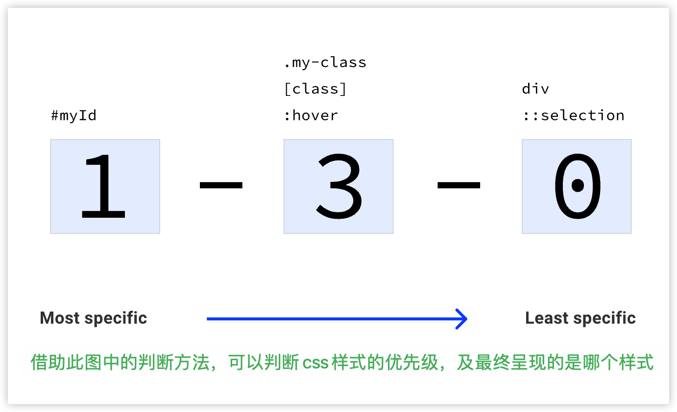 得分相同的话,后者覆盖前者。
# 继承 inherit/unset
- 明确哪些属性可以继承,哪些不可以
- 如果一个属性是可继承的,
unset关键字将与inherit相同。如果该属性不可继承,unset关键字就等于initial。 all: unset;全部重置/继承。rgb()/hsl()可以有逗号也可以用空格和/代替逗号,hsl 后两个值必须是百分比%- transparent 是一种完全透明的颜色。它也是背景色的初始值。
- currentColor 是颜色属性的上下文计算的动态值。如果你有一个红色的文本颜色,然后将边框颜色设置为 currentColor,它也将是红色。如果你定义 currentColor 的元素没有定义颜色值,currentColor 将由级联计算。
- 一个 ch 单元,它等于渲染的字体中"0"字符在其计算大小时的宽度。
- 为行高使用一个无单位的值(实际相当于百分比:
1.5===150%),而不是指定一个单位,这是一个好主意。正如你在继承模块中学到的,字体大小可以被继承。 - 如果你把 margin 或 padding 设置为百分比,它们将是父元素宽度的一部分,与方向无关。
vi:在根元素的内联轴上,占视口尺寸的 1%。vb:在根元素的块轴上,视口尺寸的 1%。- vmin/vmax:1% of the viewport's smaller/larger dimension.
- 把一列分成多列展示:
column-count: 4; column-gap: 1em;
# 文字方向
direction: rtl;文字方向从右到左writing-mode: vertical-rl;文字方向从上到下
# BFC
- BFC 全称为块级格式化上下文 (Block Formatting Context) 。
触发 BFC 的条件:dpof
- 文档的根元素(
<html>) - 浮动元素 (元素的 float 不是 none)
float: left/right; - 绝对定位元素 (元素具有 position 为 absolute 或 fixed)
position: absolute/fixed - 内联块 (元素具有
display: inline-block;) - 表格
display: table/inline-table; - 表格单元格 (元素具有
display: table-cell/table-row,HTML 表格单元格默认属性) - 表格标题 (元素具有
display: table-caption, HTML 表格标题默认属性) - 具有 overflow 且值不是 visible 或 clip 的块级元素
overflow: auto/scroll/hidden; display: flex/inline-flex/grid/inline-grid;的直接子元素display: flow-root/-webkit-box/-webkit-inline-box;column-span: all;
BFC 可以解决的问题:
- 垂直外边距重叠问题:块级元素的垂直外边距(margin)在某些情况下会发生“折叠”现象。例如,两个兄弟元素的上下外边距会合并,取其中较大的一个。但是,如果其中一个元素处于 BFC 中,就不会发生外边距合并。
- 清除浮动:当一个元素中包含浮动的子元素时,
父元素可能会出现高度塌陷问题。这是因为浮动元素脱离了文档流,不会被父元素包含在布局计算中。让父元素形成 BFC,父元素的高度被修复,能够正常包裹子元素。 - 自适应两列布局(float + overflow)、多列布局隔开浮动:当一个元素设置了浮动,且该元素的宽度小于其包含块的宽度时,会出现多列布局的效果。如果该元素也处于 BFC 中,那么其宽度会自动扩展到包含块的宽度,就不会出现隔开浮动的现象。两列之间不会重叠,保持独立布局。
- 防止浮动元素与文本重叠:浮动元素脱离文档流后,可能会与后面的块级元素或文本内容重叠。解决办法让后面的块级元素形成 BFC,从而避免浮动重叠。
# href 与 src
href 表示超文本引用,用在 link 和 a 等元素上,href 是引用和页面关联,是在当前元素和引用资源之间建立联系,src 表示引用资源,表示替换当前元素,用在 img,script,iframe 上,src 是页面内容不可缺少的一部分。
src 是 source 的缩写,是指向外部资源的位置,指向的内部会嵌入到文档中当前标签所在的位置;在请求 src 资源时会将其指向的资源下载并应用到当前文档中,例如 js 脚本,img 图片和 frame 等元素。
<script src="js.js"></script>当浏览器解析到这一句的时候会暂停其他资源的下载和处理,直至将该资源加载,编译,执行完毕,图片和 iframe 等元素也是如此,类似于该元素所指向的资源嵌套在当前标签内,这也是为什么要把 js 放在底部而不是头部。
<link href="common.css" rel="stylesheet"/>当浏览器解析到这一句的时候会识别该文档为 css 文件,会下载并且不会停止对当前文档的处理,这也是为什么建议使用 link 方式来加载 css 而不是使用@import。
补充:link 和@import 的区别:
两者都是外部引用 CSS 的方式,但是存在一定的区别:
- 区别 1:link 是 XHTML 标签,除了加载 CSS 外,还可以定义 RSS 等其他事务;@import 属于 CSS 范畴,只能加载 CSS。
- 区别 2:link 引用 CSS 时,在页面载入时同时加载;@import 需要页面网页完全载入以后加载。
- 区别 3:link 是 XHTML 标签,无兼容问题;@import 是在 CSS2.1 提出的,低版本的浏览器不支持。
- 区别 4:link 支持使用 Javascript 控制 DOM 去改变样式;而@import 不支持。
# 画三角形
<style>
  /* 纯三角形 */
  .triangle {
    position: relative;
    width: 0;
    height: 0;
    border-width: 0 50px 50px;
    border-style: solid;
    border-color: transparent transparent red;
  }
  /* 利用伪元素,画三角形的边 */
  .triangle::after {
    content: "";
    position: absolute;
    top: 1px;
    left: -48px;
    border-width: 0 48px 48px;
    border-style: solid;
    border-color: transparent transparent black;
  }
</style>
<div class="triangle"></div>
2
3
4
5
6
7
8
9
10
11
12
13
14
15
16
17
18
19
20
21
22
# 画正方形
<style>
  /* 1 */
  .square {
    position: relative;
    padding: 50%;
  }
  .c {
    position: absolute;
    background: yellowgreen;
    /* transform: translate3d(-50%, -50%, 0); */
    left: 0;
    top: 0;
    width: 200px;
    height: 200px;
  }

  /* 2 */
  .square {
    background-color: green;
    border: 1px solid black;
    width: 100px;
    height: 0;
    padding-bottom: 100px;
  }
</style>
<div class="square">
  <div class="c"></div>
</div>
2
3
4
5
6
7
8
9
10
11
12
13
14
15
16
17
18
19
20
21
22
23
24
25
26
27
28
# 加一个边框
border: 10px solid hsla(0, 0%, 100%, 0.5);
background-clip: padding-box; // 使用paddingbox
2
# 太极
.yin-yang {
  height: 200px;
  width: 200px;
  position: relative;
  background: rgb(255, 255, 255);
  background: linear-gradient(
    90deg,
    rgba(255, 255, 255, 1) 0%,
    rgba(255, 255, 255, 1) 50%,
    rgba(0, 0, 0, 1) 50%,
    rgba(0, 0, 0, 1) 100%
  );
  border-radius: 50%;
  box-sizing: border-box;
  border: 4px solid black;
}
.yin-yang::before {
  content: "";
  position: absolute;
  height: 96px;
  width: 96px;
  border-radius: 50%;
  box-sizing: border-box;
  background: black;
  border: 38px solid white;
  left: 50%;
  transform: translatex(-50%);
}
.yin-yang::after {
  content: "";
  position: absolute;
  height: 96px;
  width: 96px;
  border-radius: 50%;
  box-sizing: border-box;
  background: white;
  border: 38px solid black;
  left: 50%;
  bottom: 0;
  transform: translatex(-50%);
}
2
3
4
5
6
7
8
9
10
11
12
13
14
15
16
17
18
19
20
21
22
23
24
25
26
27
28
29
30
31
32
33
34
35
36
37
38
39
40
41
# @font-face
@font-face {
  font-family: myFirstFont; /* 必需的 */
  src: url("xxx.ttf") [, url(xxx.xyz), ...]; /* 必需的 */
}
2
3
4
# nth-child & nth-of-type
- nth-child
按照个数来算。
- nth-of-type
按照类型来计算,如果是 class 那么碰到不同类型的,单独一类,符合条件的选中。